Your Cart is Empty
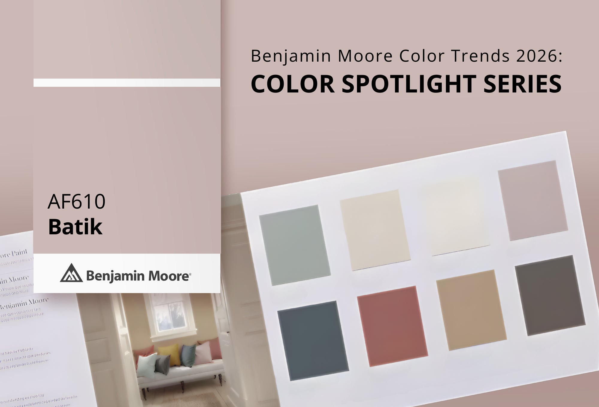
As a trusted Benjamin Moore dealer in Yakima Valley, Washington State & Oregon., Standard Paint & Flooring continues our Color Spotlight Series, where we explore each shade from the Benjamin Moore Color Trends 2026 palette — how they look in real spaces, what colors pair beautifully with them, and similar hues worth considering.
Here we highlight Batik AF‑610, a soft, muted blend of violet and rose that brings a quietly rich and elegant presence to interiors. It falls on the lighter side of this year's palette — adding an unexpected yet refined twist to neutral‑leaning schemes.

Batik AF‑610 is a uniquely versatile neutral with dusty violet‑rose undertones — soft enough to act as a calm backdrop, yet distinctive enough to read as intentional color. With a moderate Light Reflectance Value (LRV), Batik reflects light warmly without feeling chalky or washed out, making it adaptable across lighting conditions.
This hue works especially well in spaces where you want a subtle, elevated statement — think living areas, bedrooms, or even home offices where a soft sense of depth and personality is welcome.
Accent or feature walls
Living rooms and bedrooms
Main walls in open floor plans
Paired with trim or millwork in contrasting hues
Its delicate blend of warmth and muted color helps bring dimension to spaces without overpowering adjacent finishes or décor.
While it may read like a soft neutral at first glance, what makes Batik AF‑610 special is its subtle complexity. It’s a shade that doesn’t demand attention — but rewards it. A blend of violet and rose tones gives it depth, expression, and a gentle warmth that lifts a space in a way that pure neutrals sometimes can’t.
Batik bridges the gap between traditional neutrals and more expressive color, allowing you to introduce softness and nuance without committing to a strong bold tone. In a world where interiors are embracing richer, more layered palettes, Batik brings softness and sophistication in equal measure.

Here are some timeless pairings drawn from Benjamin Moore’s coordinating suggestions for Batik AF‑610:

Collector’s Item AF‑45 – A creamy off‑white that brings soft contrast and brightness.

Fossil AF‑65 — A gentle, warm neutral that layers beautifully with Batik without competing.

White Down OC‑131 – A warm, clean off‑white that elevates architectural details.

Ashley Gray HC‑87 – A deeper neutral with subtle warmth that adds grounding contrast.
These pairings help Batik feel cohesive and intentional — whether you’re anchoring a space with warm neutrals or using contrasting depths for dimension.
If you’re drawn to Batik AF‑610 but want to explore close alternatives here are some similar options from the Benjamin Moore palette:

Sonoma Clay 1242 – A soft, earthy clay tone with muted warmth.

Homespun Charm 1249 – A relaxed, gentle hue with subtle depth.

Victorian Mauve 2114‑50 – A slightly warmer mauve‑toned color with classic charm.

Gobi Desert 2110‑50 – A sandy, warm neutral with a hint of softness.
Testing these with Benjamin Moore color samples is a great way to see how each shade interacts with your unique lighting and existing finishes.

Choosing the right color — especially a nuanced hue like Batik — is easier when you can see it in person. As a local Benjamin Moore paint store in Yakima Valley, Washington State & Oregon., Standard Paint & Flooring offers expert color guidance, real paint samples, and all the tools you need to feel confident about your choices.
Visit one of our showrooms to:
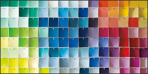
View Batik AF‑610 on large color displays
Compare it with pairing and similar Benjamin Moore hues
Pick up paint samples
Stay tuned as we continue our Benjamin Moore Color Trends 2026: Color Spotlight Series, where we dive deeper into each color from the palette and explore how to bring these shades to life in your home.

Green has always had a place in interior design. It bends with the times, showing up as sage one decade and forest the next, but it never truly disappears. When Benjamin Moore's color team narrowed down their options for 2027, green kept coming back to the table.

Discover First Crush CSP‑310 from the Benjamin Moore Color Trends 2026 palette. Learn pairing ideas, similar hues, and expert guidance from Standard Paint & Flooring, your trusted Benjamin Moore dealer in Yakima Valley, Washington State & Oregon.

Discover Raindance 1572 from the Benjamin Moore Color Trends 2026 palette. Explore pairing ideas, similar hues, and expert color guidance from Standard Paint & Flooring, Yakima Valley, Washington State & Oregon.