Your Cart is Empty

It’s time to get over gray, beige and for goodness sake, griege. As the much buzzed-about 2020 Color Trends palette from Benjamin Moore shows, there are more inspiring neutrals to explore.
But first, let’s address the pink elephant in the room: that the Color of the Year, First Light 2102-70 is, well, pink. Understandably, the choice is not sitting comfortably with everyone, especially homeowners resistant to putting a soft, rosy hue on the walls.
Yet, put on rose-colored glasses and view First Light not as pink but as “the backdrop for a bright new decade,” and you might begin to see things differently.
“It’s something you can really live with day in and day out,” pointed out Andrea Magno, Benjamin Moore Director of Colour Marketing and Development in Architectural Digest. “Even if you use it on all four walls, it’s enhancing the surroundings, pulling everything together. It’s not like, ‘whoa!’”
While traditional neutrals are great, Ben Moore pronounces that it’s time to bring color back into our living spaces in a way that truly transcends color.
“We selected First Light as our Color of the Year to represent a new dawn of idealism, design and living. It reflects a new definition of the home – a shift in mindset from the material to satisfying the core needs in life: community, comfort, security, self-expression, authenticity and ultimately, optimism.”
First Light 2102-70 is a flexible neutral that floats between warm and cool. It’s at the forefront of Benjamin Moore’s Color Trends 2020 collection, a palette of supporting players that each offer a timeless way to lighten up.

A refreshing wash of pink, First Light 2102-70 uplifts.

A neutral that floats between warm and cool, Thunder AF-685 centers.

An effervescent, silvery jade, Crystalline AF-485 invigorates.

Earthy and enveloping, Cushing Green HC-125 anchors.

A playful periwinkle, Windmill Wings 2067-60 animates.

Like perfectly faded blue jeans, Oxford Gray 2128-40 comforts.

An easygoing blue-green, Buxton Blue HC-149 calms.

A deeply elegant sapphire, Blue Danube 2062-30 elevates.

Clean and cool, White Heron OC-57 refines.

A cross between honey and cream, Golden Straw 2152-50 illuminates.
Look, no matter how we frame it, not everyone is going to love the Color of the Year – and that’s perfectly fine, admitted Magno. There’s surely something in Benjamin Moore’s 2020 Color Trends palette that will satisfy every discerning eye.
“Color is powerful but highly subjective, especially through the lens of different generations, relationships and moods,” she said. “But from the saturated to bright and airy, all are easy to live with and easy to love – whether they stand alone, in a strong pair or all cohabitate.”
Explore the entire 2020 Color Trends Collection from Benjamin Moore here, or pick up your sample of the 2020 Color of the Year at your nearest Standard Paint & Flooring location.

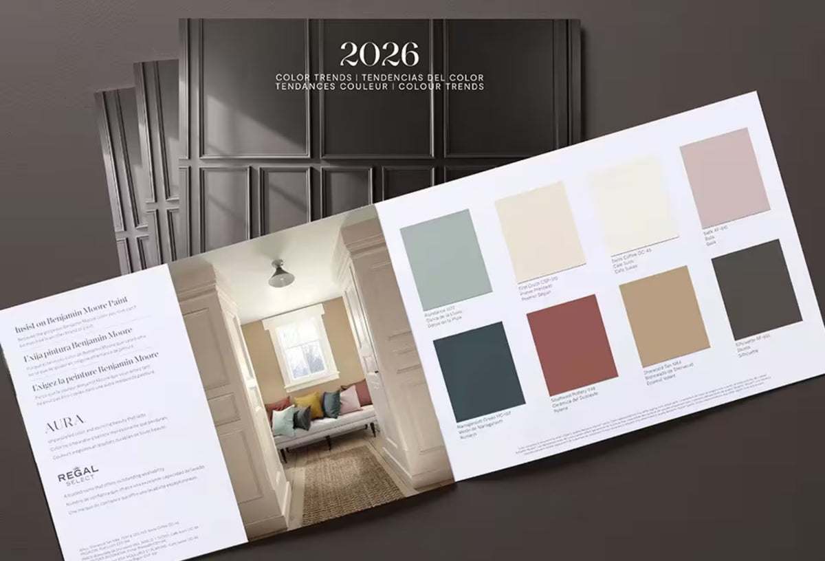
Find fresh color inspiration for 2026 with Benjamin Moore’s new Color of the Year and Color Trends Palette. Silhouette is a study in balance — rich yet restrained, moody yet inviting.

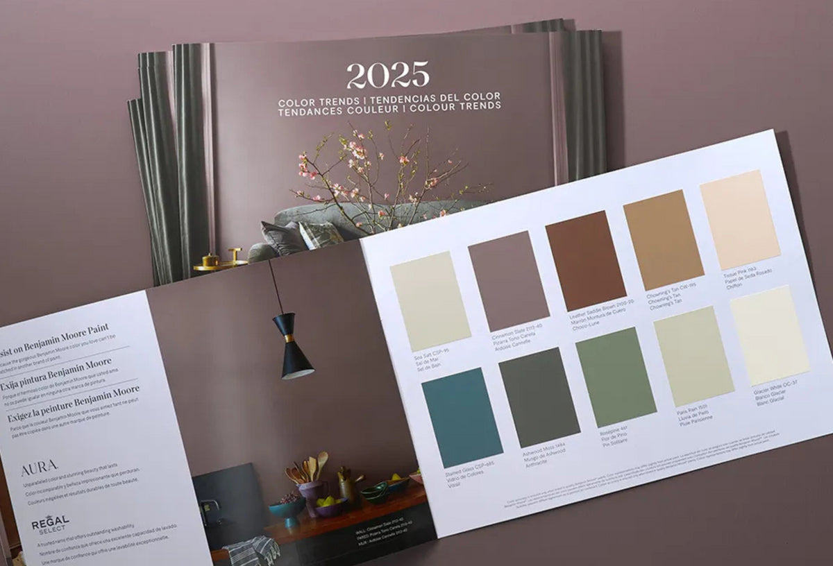
Every year, paint enthusiasts and interior designers eagerly await the announcement of Benjamin Moore’s Color of the Year, a paint trend forecast that sparks excitement and debate. Whether people are quick to embrace the color or need time to warm up to it, the influence on paint and design trends is undeniable. For 2025, Benjamin Moore introduces Cinnamon Slate (2113-40), a color that’s set to redefine how we approach interior paint choices.
